
For the past two weeks or so I’ve been working on a new version of my interactive Warhammer 40,000 map. I wanted to improve the performance of the map, as well as add more features to it so that it could fit my original idea of showing the progress of the Horus Heresy.
My original map used a library called KineticJS but this hadn’t been updated in a while. I didn’t mind, as it suited my purposes for the most part, but for this version I wanted to use a library that was still being updated. I tried a few, but either couldn’t get them to work with the data I already had, or just weren’t a fit for my project. I tried Polymaps, Jvectormaps, Konva and D3.js.
Setup
Then I came across Leaflet. It was easy to set up, and had what looked like a journey feature built in that I would need later when plotting the route of the Horus Heresy.
I immediately started setting up the map using my old map as a base. I added in the different images I used for the background and the regions. Once I’d plugged some of this in, I noticed an issue with there being a border visible at the edge of the map where the image was not the same resolution as my monitor. A quick search found a plugin that fixed this problem for me, and it had been added to Github not 8 hours earlier! Lucky me 🙂
Planets
The examples already had map markers so I figured my next port of call was setting up the planets. For these I started out with the example code, but I didn’t like the click-to-view, so I changed this to a hover based label.
The map markers defaulted to an image, but I wanted to use the CSS that I had set up for my other map. To do this I had to make custom markers which was easy to do following the Leaflet documentation.
I made a copy of my Excel sheet and changed the code generator to reflect the Leaflet code. With this I could then copy the thousands of planets I had on my other map into Leaflet easily. Plugging everything in I realised the coordinates weren’t quite matching up and I had to tweak the code. It turns out that in Leaflet the XY values are reversed (so it needs coordinates in a YX format) and also the location of 0,0 was at the bottom left of the grid, not the top left. Luckily the numbers themselves didn’t need any changing – at this point (I change the size of my map later on and this meant I needed to shift the coordinates slightly).
Regions
Now that I had the planets sorted, I started work on adding the regions. All the data I used from my previous map was in SVG format but Leaflet didn’t seem support it. I spent ages looking into converting my data to geoJSON which is what Leaflet prefers but I gave up and decided to do it using excel to do the calculations for me as I had done with the planets. This was all fine until I realised that I couldn’t add in curves so I went looking for a plugin that allowed that, and lo and behold the plugin I found – Leaflet.Curve – also supports SVG. I was pleased I’d found a solution, but not that I lost a couple of days to this (I even had Tom looking at writing a script to do the conversion for me). I still needed to tweak the original data (this plugin could not cope with relative coordinates, and I’d decided to make the map grid bigger so that the background image I was using wasn’t so cut off) so at least I had the challenge of making an excel sheet to do my work for me, and I love doing that
I’ve uploaded my spreadsheet if you would find it helpful, but it isn’t a pretty fix by any means.
Though my spreadsheet did all the calculations for me I still had to manually enter each set of SVG data and the resulting code for the Leaflet.Curve plugin needed to then have any errors filtered out. I would enter all my SVG coordinates one at a time into a grid and this would generate the appropriate Leaflet compatible version (including adjusting the coordinates to take into account the larger grid size).
| SVG (from Adobe Illustrator) | Leaflet.Curve compatible |
|---|---|
| M 0, 0.466 c 0, 6.456, 0, 764.867, 0, 764.867 l 428.186, 146.333 c 0, 0, 87.878 -77.051, 203.636 -137.679 C 741.043, 716.781, 832.715, 703, 832.715, 703 l -48.649 -83 c 0, 0-34.698 -59.85 -82.338 -142.024 c -0.162 -0.279 -0.005, 0.198 -0.005, 0.05 c 0, 29.178, 0.177, 253.107, 0.177, 253.107 s -755.909 -0.011 -693.234 -0.011 c 0.391, 0, 0 -719.455, 0 -719.455 h 422.001 L 424.333, 0 C 424.333, 0, 0, 0.462, 0, 0.466 z | [‘M’,[1849.534,500],’C’,[1843.078,500],[1084.667,500],[1084.667,500],’L’,[938.334,928.186],’C’,[938.334,928.186],[1015.385,1016.064],[1076.013,1131.822],’C’,[1133.219,1241.043],[1147,1332.715],[1147,1332.715],’L’,[1230,1284.066],’C’,[1230,1284.066],[1289.85,1249.368],[1372.024,1201.728],’C’,[1372.303,1201.566],[1371.826,1201.723],[1371.826,1201.723],’C’,[1342.796,1201.723],[1118.867,1201.9],[1118.867,1201.9],’S’,[1118.878,508.666],[1118.878,508.666],’C’,[1118.878,509.057],[1838.333,508.666],[1838.333,508.666],’H’,[1838.333,930.667],’L’,[1850,924.333],’C’,[1850,924.333],[1849.538,500],[1849.534,500],’Z’] |
Once I had started adding regions, I noticed Leaflet was much less forgiving when it came to untidy shapes (or perhaps it was just the styling I was using). So I spent some time (read: days) tidying up the coordinates so that all the shapes matched up and didn’t overlap. It took some messing around adding in map markers to see what order each set of coordinates was listed in, and reworking the order they were listed.
Mouseovers and Classes
When I had a few regions on the map, I started to work out how to highlight them on mouseover and bring up information about the region. I found some code in the documentation that would work on a single region, but to work on multiple I’d need to add the code to each region I wanted to make. That seemed like it would a lot of time to do (and add extra load time) to me so I had a look into how to apply the same code to multiple shapes.
I ended up writing a class after coming across an example in the documentation. The class would take all of the data for the region, including the coordinates that I stored in an array, to make a Leaflet.Curve shape for the region including the default styling and mouseover style changes.
I wrote a similar class to generate my map markers too (though this didn’t need the style changing section) and would later extend both of these to generate the labels for my information popup (see below).
Minimaps
Something else I spotted going through the documentation and plugins for inspiration and help, was the ability to add a minimap to the map. Tom had said he was having trouble navigating as the map itself was so big.
I experimented with changing the zoom level based on monitor size but this seemed overly complicated and the way I had implemented it ended up breaking the built in zoom control.
I came across a minimap plugin that seemed very useful, but took some time for me to set it up and even then I couldn’t quite get it working properly. It took me a while to realise that I could not use a single image as a background for this particular plugin and would need to split my background into several 256×256 squares for each zoom level I wanted to show.
To generate these squares I broke out Photoshop. It has a slice feature that allowed me to break up the map easily into the required tiles (though renaming all of those slices to match what Leaflet was expecting was not a fun task). Plus, by keeping the .psd files, I could easily change the background image and regenerate the tiles without too much hassle.
I saved out 6 different zoom levels in the end from 1 to -4. I set up the minimap itself to always show at a -4 zoom so no matter your screen size and zoom level you could always see a full version of the map. The other zoom levels would be used by the map itself.
There were a lot of tiles to make given the size of the map and the zoom levels needed. I don’t want to think about how many I’d have to make if my map was bigger.
| Zoom Level | Tiles |
|---|---|
| 1 | 544 |
| 0 | 160 |
| -1 | 48 |
| -2 | 16 |
| -3 | 9 |
| -4 | 6 |
Information Popup
A feature of my other map is that you could see the name of the regions. In this map I couldn’t. So I wanted to find a way of showing the name of the region on mouseover. I couldn’t find a way of making the name appear where the mouse was using map markers for the region names, but I did find some code on one of the Leaft tutorials for a choropleth map that added a popup to show this information.
With the new information popup, I thought I could apply this to my planets too (though keeping the popup at the mouse location with the name of the planet). I wanted to make sure there was some info to show in it besides the planet’s name, so I spent a really long time updating my Excel sheet with information on each planet and region. Simple stuff like location, purpose, climate etc. I ploughed through the Wikia to help me. I’ve not finished this part yet, but the map is working well enough to show it off.
The Wikia was helpful in another way, in that it helped me spot that I’d made a few mistakes with locations (for example, the Gothic Sector was in completely the wrong place) so I corrected these too. To be honest, this was the part that took the most time – probably about a week looking at the drafts of this blog post – as I had to redraw regions and reposition planets.
The (almost) Finished Map
I’ve whittered on enough about the creation process, if you want to take a look at the map you can, either through the main directory, or through the version 2 directory. It’s not completely finished, but you get the idea I hope. Let me know what you think!
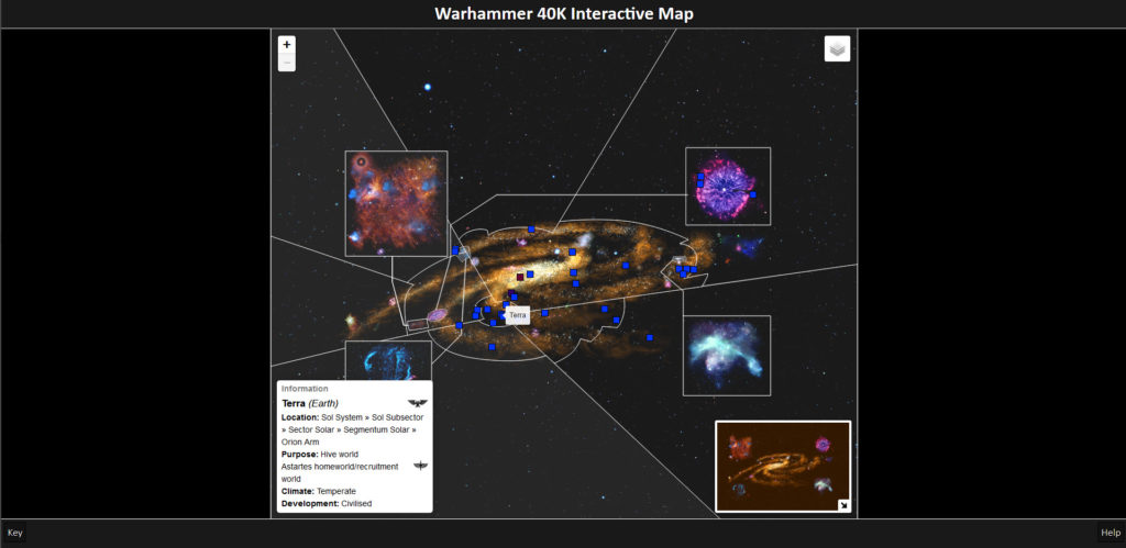
Version 1 of the map is also still available for comparison.
There are controls in the top-left for zooming in and out (though you can do that with your mouse wheel too), and the minimap is visible in the bottom-right of the screen so you can navigate by that too. The orange box will show the region you are currently viewing.
The top-right is the layers control which lets you select what you want to see. You can choose between several different layers (the segmentum view is the default), and pick which planets you want to see (only major planets are shown by default).
The control in the bottom-left will update when you hover over a planet or region. This may not work completely as some regions overlap each other. I’m working on fixing that – it just needs the SVG data to be updated and the converted to Curve-compatible code.